Variations on Presenting the Distribution of Data
The primary method of presenting the distribution of univariate data is via a frequency histogram. This graph is particularly useful if the data is discrete - meaning that it can only take on a fixed number of outcomes. Even when it is not discrete, using ranges allows us to present the distribution of the data in a readable way.
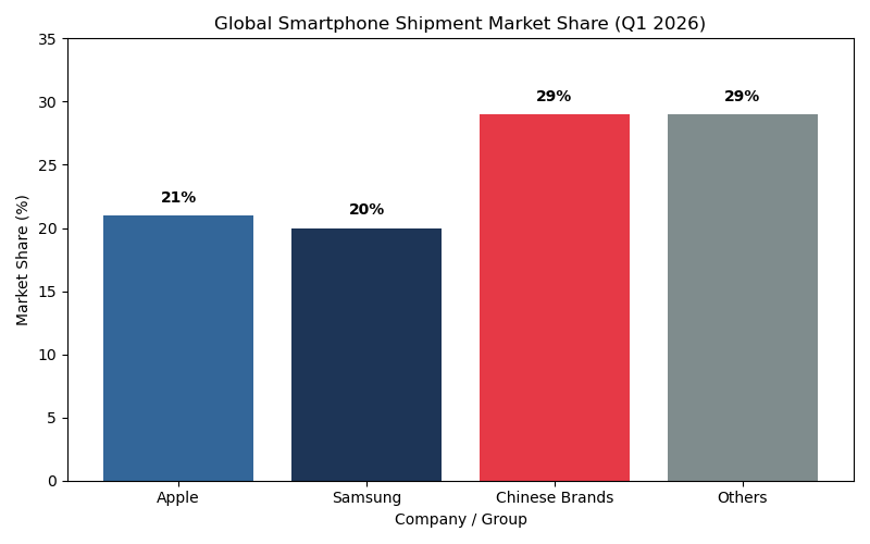
But there are many alternatives to this used in practice. This page goes through these methods, with an emphasis on two things. First, they are often just different ways of showing the data. Second, we should be cognizant of how the information in the data is being summarized (so information is lost).For discrete data that only takes on a few values all of the methods are quite similar in terms of expressing the information. We will use data on smart phone market share for this case, where the data is categorical so not ordered. I have bundled a number of Chinese makers into one group (Xiaomi, Vivo and Oppo) because it helps make a nice point later. The frequency graph for this is as follows:
On to the alternatives!
1. Smoothed Histograms
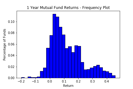
To construct the histogram above, we select ranges and compute how many returns are in each range, then the height is the proportion of returns in that range. One way to think of this is that for any possible return (call it x), we look at a range around this value and compute the height based on the number of returns in that range. The histogram above then is choosing a few values for x and the range carefully so that the x's are the center of each range, then construct the histogram.
Instead of choosing just a few x, why not compute this for every x along the possible values for the returns, record the height that would occur for the range, and report that curve. This curve will be smooth, which is great, but counts returns many times. This is because for x's near each other, the ranges overlap, so the same return gets counted for both. So we get a smooth curve, but the area under the curve is no longer the frequency because of the double counting and the area below the curve is not equal to one. The fix, not hard, is to divide all the heights by the area under the curve, which means that the new curve has an area of one.
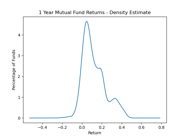
Doing this for the returns data, we have the above curve. Clearly it looks a lot like the histogram, but is instead a nice smooth curve. Areas under the curve for any range for x are equal to the relative proportion of returns in that range.
2. Pie Charts
For the smart phone data, we can put the same information into a pie that is in the frequency graph. This leaves us with the following figure:
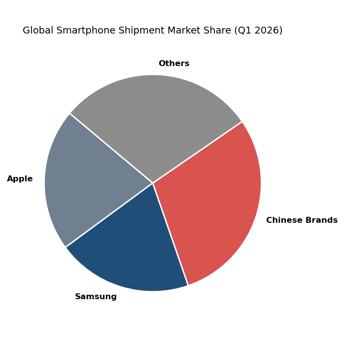
There is nothing particularly wrong with this figure, it shows a lot of the detail we might want. For example we see that Samsung and Apple have similar market shares, as do the Chinese and 'Other' brands, with the latter two having higher market shares by a bit over Apple and Samsung. The main issue we might worry about, which is evident in the frequency graph even without the labelling of the numbers, is that Apple has a one percent higher market share than Samsung, but we really cannot see that. Similarly the Chinese brands and other have exactly the same market share, but we cannot see that on the pie clearly even though it is evident on the frequency graph. We can of course add labelling, as I do now:
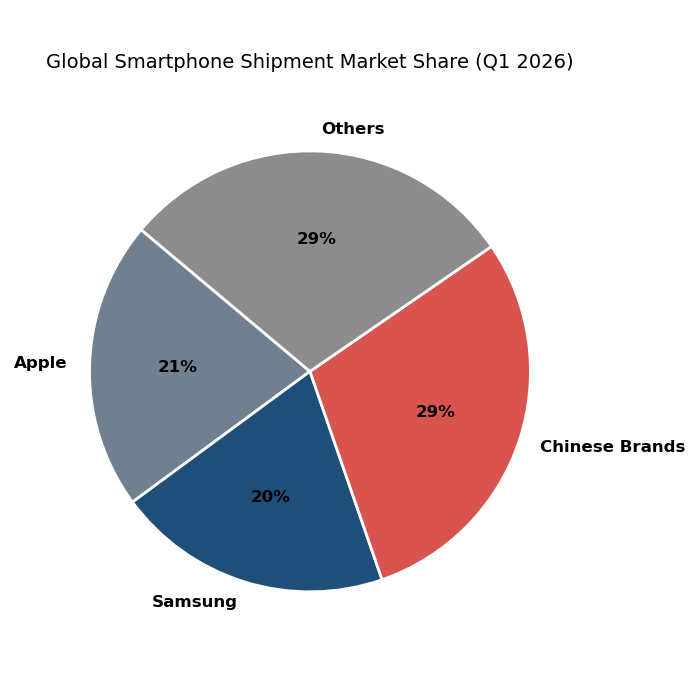
So now it is clear again, but we had to add the labelling to make it clear. We cannot really use the labelling approach very well if there are lots of categories, because then it will be too busy.
3. Waffle Charts
Waffle charts were really just a simple way of showing a progress bar. The idea is that you would have a square or rectangle with say 100 boxes in it, and if progress was at 20% then you would have 20 of the 100 boxes (next to each other) shown with a different color. At a glance you could then see how much progress there was and how much more needed to be done (think downloading a program).
But with software available comes adaption, and so these graphs have been adapted to basically show the same information in a frequency histogram, but now the frequencies are given as areas in a square or rectangle with boxes in much the same way as a pie chart is round and does so with wedges. We can see this with the smart phone example:
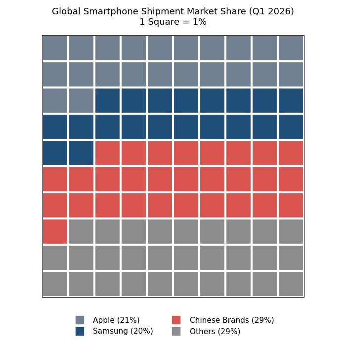
You can distinuish close numbers (like between Apple and Samsung) through counting the boxes. But we have also added the data into the legend, which we did because it is still not obvious. Frequency graphs are a bit boring but they are better for showing the nuance of the information.
Copyright © Graham Elliott
Distributed By Themewagon