2. Data Description
We will start by building tools to work with data. Many of them you will be familiar with, however there are things that can go wrong and their are useful interpretations of these tools. Even though the tools we are working with are simple, many complicated statistics and graphs are generalizations of these and we need an understanding of the basics first. What you should notice is that many of the calculations made to present the data are in the form of sample means of some simple transformation of the data. Much of the formal work we do is for sample means, but it works for many of the things we do when making tables or figures.
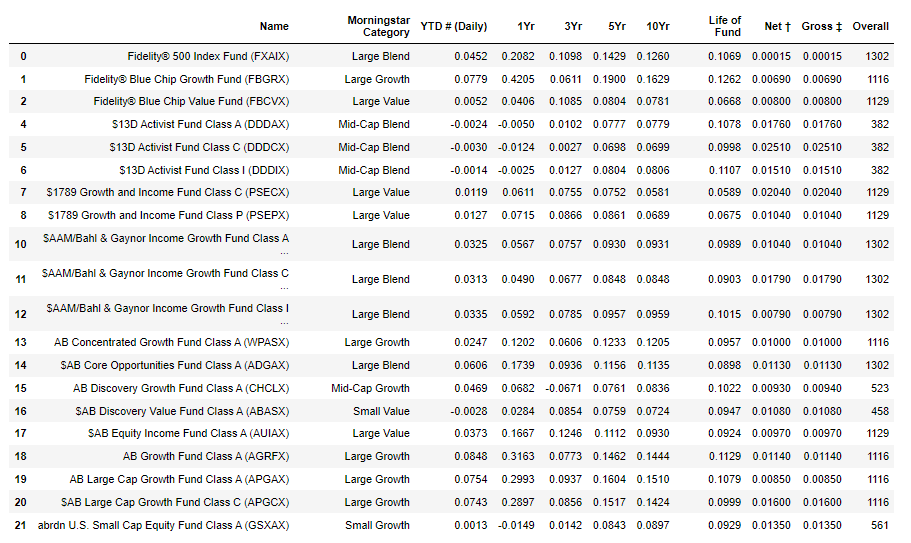
It is becoming more true by the day that our ability to construct larger and larger datasets is becoming easier and easier. It is often the case that we have very large datasets available, something that used to be hard but now with webscraping and computerized forms etc. is quite easy. For many of the examples in this chapter we will employ some data from Fidelity on mutual fund returns, which was publically available from their website. The original data has information on 2676 funds that you could invest in, downloaded February 2023. For each datapoint for most observations we have a lot of information on each fund - it's name, category returns over various horizons, fee information as well as a rating. The following picture gives some of the data
This is a lot of data, but is relatively small compared to the datasets many researchers examine. Even so, it is far too much data to look at easily in a pile of pages. Competence in statistics means being able to use the data in a way to find results and convince others of the validity of your results. Like most things the basics are really easy, but doing it well is much harder.
A general overriding principle is that whilst having the right data can answer lots of questions, it is usually far better to summarize the data in ways that answer the question you have. This is sometimes referred to as 'telling a story' with data, but in practice we want to use the data to clearly answer the question we have should the data be precise enough, otherwise we want the summaries of the data to show us the limitations of using the data to answer our questions. Sometimes this will involve graphs, often just using tables of statisics if they are presented well (and look good, see this (not mine) for example.
Before we begin, we do need to think about 'types' of data. Since we will be doing a lot of math with numbers, it makes sense that data is represented by numbers. But not all data is numerical in the sense that the numbers mean something. Looking at the above table, clearly the returns data for each horizon make sense as numbers, the number directly represents the return on the investment. But in addition to numerical data, we often have categorical data. This is what it sounds like - data that defines different categories or traits, with no obvious mapping to numbers. In the above table we see the category for different types of funds (small or large, growth, value or blend). This data is handled slightly differently that standard numerical data, and we have to be mindful of which type of data we are using. Often with categorical data we define numbers to represent them, so we can do math easily even though the particular numbers themselves are meaningless. For example a data set for incomes might distinguish between male or female for each of the people. We would typically assign the values zero or one (this makes the math easier) for one or the other - which does not matter for the analysis. But it helps when doing computations.
We will return to this, but nearly all of the elements of each graph we make are actually point estimates of some form. Indeed, a great number of them are just averages of the data. We can summarize with these point estimates as we do in Section 2 and 4 here, or we can draw pictures with the point estimates as we do in Sections 1 and 3. Much of the formalization of statistics is understanding how good our point estimates are, this extends then to the graphical methods as well.
2.1 Graphs with a Single Variable
Even the prettiest and most clever modern style graphs relate back to a few basic graphs and the principles that underly these basic graphs continue to be relevant in fancier pictures. So it is worth starting with simple and quite possibly familiar summaries of a single data variable. By single data variable I mean we have multiple observations measuring the same or very similar things, such as returns over many mutual funds or incomes over many people or measurements of temperature over time.
Consider the one year returns in our mutual fund data. We could compile the data on returns into a list of say observations. Throughout this course we will refer to observations more abstractly as lower case late in the alphabet letters, for example our dataset could be represented by the set of numbers ${x_1,x_2,x_3,...,x_{n}}$ where n=2333 in my example (we lost some through missing observations). Here $x_1$ simply refers to the first observation, $x_2$ to the second observation etc.
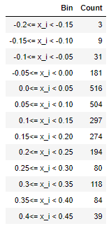
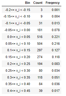
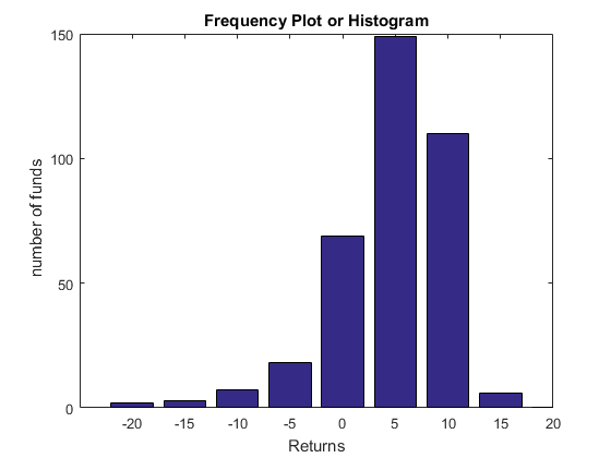
For many problems we are not too worried about small differences, we can create a summary of the types of returns through choosing some 'bins' or ranges of possible returns to simplify the data. My returns range from just above $-20\%$ (yes, you can loose money in mutual funds) to just under $45\%$. I will take bins of $5\%$ width from $-20\%$ to $45\%$ to cover all the data I have. Then we count how many funds fall into each bin. The following table can now be used to represent the data.
We refer to this as a counts table or histogram table, and it clearly gives a much clearer impression of the last year returns than trying to look at all of the data on the Fidelity page. Notice that to avoid overlap we have a weak inequality at the lower end and a strict inequality at the upper end, i.e. each bin includes any $ x_{i}$ so long as lower bound $ \leq x_{i} < $ upper bound for each set of bounds. This is a standard convention, but is one that maps directly to doing formal statistics so we will keep to it.
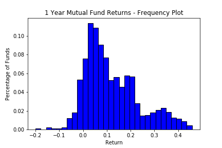
Rather than put this in a table it would seem cleaner and clearer to put this in a graph, we could graph the x axis being returns and the y axis being the number of funds in each range. This is a standard approach and is called a frequency graph or histogram. The same data from the table is in the following figure.
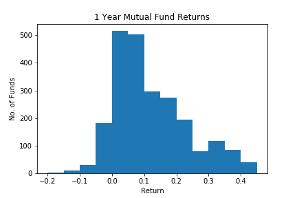
The bins are centered on the lower end, so for 0 we have $ 0 \leq x_i < 5 $ or returns in the range from zero to just less than 5. The information in the table and figure are the same, but the visual impact in the histogram is much stronger. We see clearly that a vast majority of the returns are between zero and 20%, not so many are making losses and not so many are doing better than 30%. This is of course the point of the exercise, to show clearly what is going on with the data. Whether or not we use a graph or a table, we refer to methods that describe the types of values that can occur and their frequency as the distribution of the data. Later, when we do formal statistics, we will have formal definitions of 'distribution' however in descriptive statistics this is the relevant definition in general use.
Rather than have the number of firms on the y axis, it is often more interesting to have the proportion of firms on the y axis. We obtain this by simply dividing the number of firms in each bin by the total number, so that the height of the histogram is now the percentage of firms (frequency) in that group instead of the number. Put in a frequency table, we have the following:

Whilst we have plenty of software to construct these graphs, it is good to understand that the heights of each of the bins is just a calculation with data. Define the function $$ 1(A) = \begin{cases} 0 & \quad \text{if A is false}\\ 1 & \quad \text{if A is true }\\ \end{cases} $$ then if we define $A = \text{lower bound} \leq x_{i} < \text{upper bound}$ then we have that the height of the frequency graph for any bin is equal to $$ \text{frequency} = \frac{1}{n} \sum_{i=1}^{n} 1(\text{lower bound} \leq x_{i} < \text{upper bound})$$ In this course we will see a lot about how to understand statistics like this.
My histograms are pretty ugly, there is a lot of cosmetic changes one could do to improve them. In this case a simple thing to do is to add more boxes, so that we can see the shape better (and include a little more information). Rules of thumb for the number of boxes abound in the 'best practices' world, for example using the number of bins equal to the square root of the sample size. I recommend ignoring these rules of thumb and letting your creative side take over. If it looks good, it looks good!. The other cosmetic change I did was to add black lines around the boxes, which makes them look better. And you must always label axes so that the reader knows what data you are presenting.
This reworking of the same information brings up an important feature of the histogram. When we use proportions as in the frequency graph, this means that the areas of the boxes above each bin correspond to the proportion of firms in that bin. Hence the areas of the bins (given a width of one) is equal to 1. In visually representing this well, we want that if the area of the box is twice that of another box then it should have twice the proportion of firms. Said another way, the areas of the boxes need to correspond to the proportions. That areas in the histogram correspond to the actual frequency of the observations is the Golden rule of Histograms. This is not always done correctly. Sometimes wider boxes are used at the upper and lower end of the histogram, and so if we do not halve the height when we double the width the areas no longer sum to one and the visual respresentation would suggest that it is much more likely to be in the sides of the distribution than is really true. It is not the point of the exercise to mislead, so we will always make sure that the areas correspond to the proportions rather than corresponding to the y axis. Of course the easiest way to avoid this is to keep all the bins of equal width.
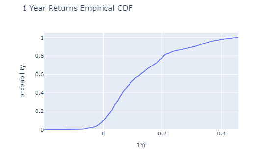
Rather than having bins like this, we could always compute the same information as 'all the bins up to a certain number', which is just the cumulative version of this. In the table form we now have (adding to our earlier table)
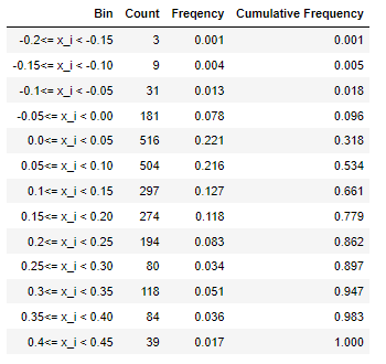
Now we read the final column, the cumulative frequencies, as the proportion of observations below each upper bound. This means they are either in the bin at the upper bound, or one of the ones below it. We can also construct a graphical representation of this data, as in the following graph.
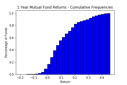
This way we can easily see the same data in a different light, so we know that 10% of the funds give returns less than 0% (recall that the names of the bins is the upper bound). Such cumulative plots have their uses, but from the perspective of our data (which we had to put into bins) it makes little sense to do this. We could have simply chosen each possible point on the x axis and computed the proportion of funds that had returns lower than that number. Mathematically this is $\frac{1}{n}\sum_{i=1}^{n}{1(x_i\text{<}x })$
Now we have a fairly nice way of summarizing the original data that is clear and understandable.
2.1.1 Issues with Histograms
There are lots of variations on histograms, as well as ways to use them poorly. We go through this here.
Histograms can be poorly constructed, where by poorly we mean that they result in misleading visual expression of what is actually going on. Unfortunately it is often the case that histograms as presented are misleading. Often this is done intentionally (the data does not always back up the story you want to give), other times it is because correctly drawn histograms can be visually unpleasing even if they convey the correct information.
Consider the following data from the Program for Insternational Student Assessment (PISA) run by the OECD for 15 year olds. The intention of these exams is to evaluate on a comparable method education across countries. The following table gives results from 2009 for selected countries. The source for this data is a college board publication.
| Country | Reading | Math |
|---|---|---|
| Korea | 539 | 546 |
| Singapore | 526 | 562 |
| Japan | 520 | 529 |
| Australia | 515 | 514 |
| US | 500 | 487 |
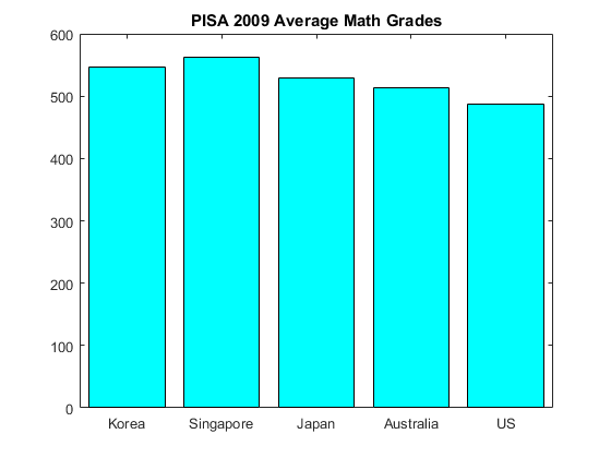
We can draw a histogram, or bar graph as it is often called with a categorical set of data (here the categories are countries). The principals are the same. Suppose we present this data as in the graph next to the text. It is at first glance far more informative than the table presented above. Instead of having to go scouring through looking at one country whilst remembering the scores from another, you can see at a glance that Singapore has the highest math scores, and that the US is far behind.
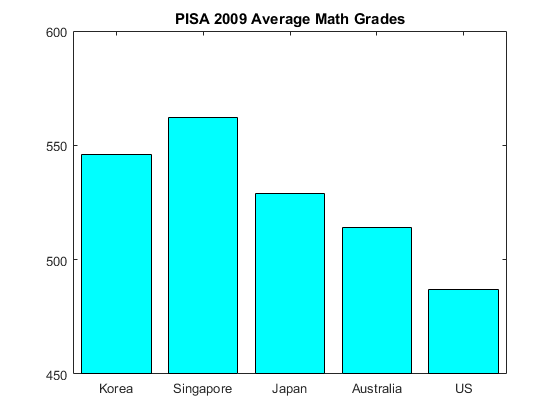
Or is it? The histogram/bar graph breaks the rule of having the areas of the graph being comparable across different columns. This is done here by making the x-axis start at 450 instead of zero. Visually we have the impression from looking at the graph that Singaporeans did three times better than students in the US, however working it out from the table we see that the real percentage difference is $15\%$ better. Not insubstantial perhaps, but not three times as good (sorry lah). This is the standard way of misrepresenting data in bar graphs and histograms - making the areas not be proportional to the actual numbers. It is fairly easy to not make this error. See Figure 6 for a more accurate representation.
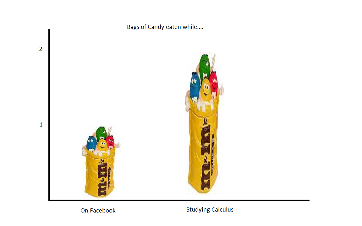
Unfortunately this type of misrepresentation is common. We will always examine the figures before making conclusions, finding that this trick is being played in a standard histogram is pretty simple, just look at the axis. Because bars like the ones above are pretty boring, often instead of the bars there has been a move towards pictographs. For example in the above figures instead of bars we could have a picture of a student where the height of the student represents the height of the bar graph or histogram. There is nothing wrong with this, except that often when this is done another error leads to a visual misinterpretation.
To see this, look at the following picture. Despite the images instead of boxes for the bars, this is just a histogram. Looking quickly at the graph, the impression you would get is that students eat a lot more candy, many times more candy, when studying calculus over looking at Facebook. The reason for this visual impression is that the figure above calculus is much bigger than that above lookin at Facebook. But a quick look at the numbers on the y axis shows that actually we have only doubled the number of bags of candy, which is much less than we would guess just visually. What happened? When I made the graph, to make it look nice, I made the figure wider as well as taller. It is taller up to the double the size, but wider as well so the area is much more than two times the area for the 'facebook' figure. Hence the larger impression visually.
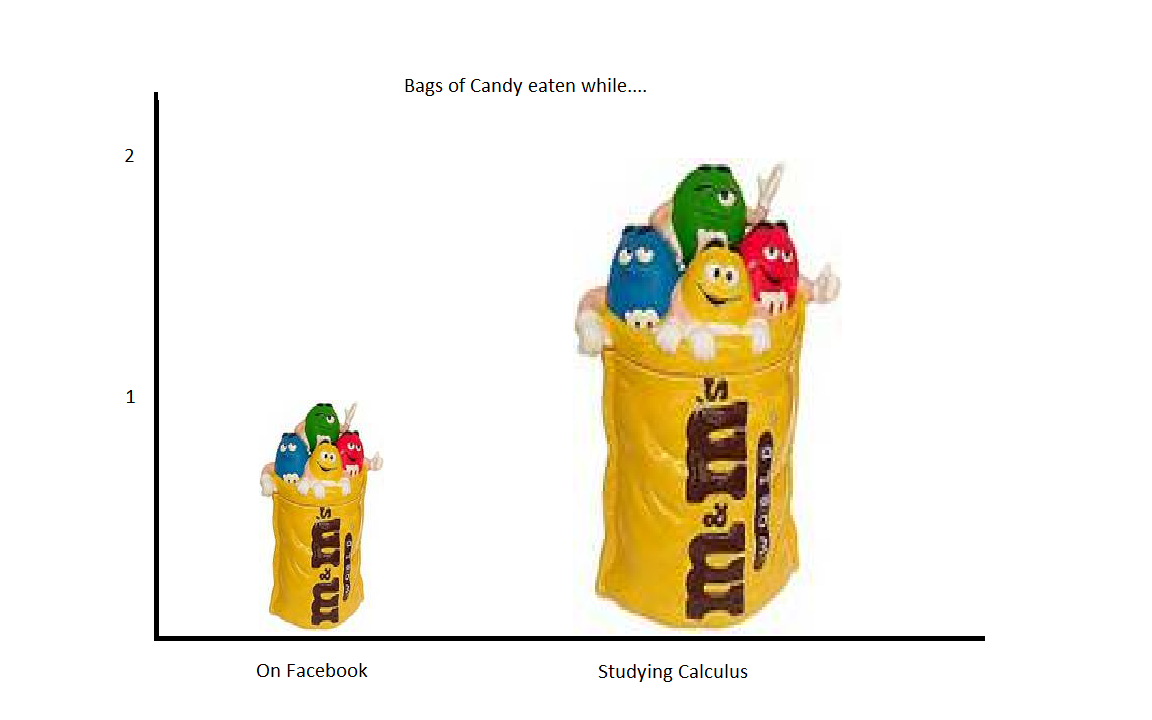
What I would need to do here is make sure that when I double the height I keep the width the same. This gives the correct visual impression, as in the next Figure, however looks a bit silly because I have had to stretch the figure. None-the-less this is at least correct. The basic rule is that the areas should be proportional, not just the height. This rule should always be followed. Note that in most programs now (Excel 2016 for example) the program allows you to make a pictograph histogram like these very easily, but not to change the width. It gives the same distortions as in my figure, which is better than getting it wrong.
2.1.2 Pie Graphs
Pie graphs are basically frequency histograms presented in a way that makes the relationship with the total area (which is one, since the frequencies sum to one) clearer visually. The following figure shows a bar graph for sources of energy at UCSD in the first quarter of 2016. It is a frequency plot just as in Figure 2 where now instead of bins on the x axis we have categories (the bins are really ordered categories, here there is no obvious ordering but this makes no difference).
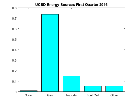
The bar graph is easy to interpret. Clearly the main source of energy is gas (this is energy derived from gas plants on campus), with imports making up a not insignificant component and solar and fuel cells contributing much less. There is nothing wrong with this graph. We can see what is going on without too much trouble. To understand the percentage we do need to look at the y axis, we see that gas provides about three quarters of the energy. You need to do some calculations to see that adding up solar, fuel cell and other results in a bit more than $10\%$ of the total. It is calculations like this that pie charts make easy.
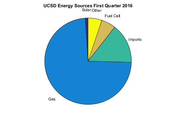
If we look at the pie chart it is just as easy as the bar chart to see that about three quarters of the energy comes from gas. However when we add solar, fuel cell and other together we see very quickly without any real math that it is a about $\frac{1}{8} th$ of the total. One useful thing regarding pie graphs is because everything really must add up to $100\%$ then they are hard to mess up. The areas naturally become proportional. This said, sometimes it is better to stick with a bar graph, see Box XX.
There are many other types of graphs.
2.1.3 Time Series or Line Plots
When data is ordered by time, it is often much more insightful to graph the variable or variables you are insterested against time. This is straightforward, however it can still lead to misleading results if you play around with the scaling.
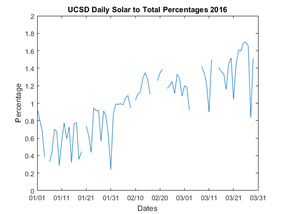
The following graph shows the percentage of energy contributed from solar (relative to total energy used at UCSD) over the first quarter of 2016. All the graph shows is each day on the x axis and the daily percentage on the y axis. The empty parts are just days where I did not have all the data, it is better to leave it blank in that case and does not harm the overall insights from the plot. We see fairly clearly that in January solar is contributing about one half a percent, but by March it is almost three times that percentage. Notice that when interpreting the information, we really need to look at the y axis numbers to really understand what is going on. We can see at a glance that the percentages are increasing as we move towards summer, but to really understand magnitudes of effects we really must look at the numbers on the y axis. This is especially true because messing with the axis limits (just like in a histogram) can change the visual look in ways that lead to different impressions.
2.1.4 Box Plots
Box Plots are a useful way to show the distribution of the data without full detail as to the shape. It is best used when you want side by side comparisons of distributions. The actual information in the box plot are summary statistics of the distribution, which we cover in the next subsection. What is plotted for each distribution is a box with a line in the middle (see Figure 10) and an upper and lower end. The middle line, green in my boxplot, is the median. The outer ends of the box are the first and third interqaurtile ranges (IQR). The whiskers here are the min and the max. The dots you sometimes see outside the whiskers are what are known as outliers, although the precise meaning of what an outlier is is generally up for debate. Since we are supposed to be examining the data, best to just have the data.
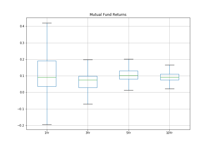
The data plotted in this plot are the mutual fund data from before, along with the same results for along with the three, five and ten year past returns. The useful features of a boxplot can be seen directly from this Figure. Most of the data (half of the data points) are inside the box. So when we see that the boxes mostly line up we see that most of the returns for both low and high fee funds are basically in the same range. It is clear though comparing the boxes that the longer period returns vary much less than the shorter ones. This is a fundamental truth about diversified funds, that over a longer time it is hard for a fund to consistently do well, the actual choice of funds is much less important than actually investing in one. One of the interesting things you can see here is the benefits to a long investment horizon - one year returns are quite variable (in finance we refer to this as risk) but at the ten year horizon the risk of any fund is much smaller!
2.2 Summary Measures for a Single Variable
Data can also be described with numbers rather than graphs. Although to be fair all the parts of the graphs are really numbers, sometimes the same ones we discuss in this section and beyond in this class.
All of the measures we will look at can be thought of as estimates from the data describing features from the distributions we looked at in Section 1. We again have the situation that we observe multiple observations of a single variable, denoted ${x_1,x_2,x_3,...,x_{n}.}$
2.2.1 Measures of Central Tendency
The idea of central tendency measures is to pick a single number that describes the center of the distribution. We commonly refer to this as the 'average'. Suppose that you needed to summarize the height of college students. The usual way to do this might be to answer `students have an average height of ...' This is an attempt to render the great diversity of heights into a simple number which tries to give the idea of the `usual' student. In most cases the first number you might report is like this, some type of measure of central tendency of the distribution of heights. We have three measures that are commonly used.
2.2.1(i) Sample Mean
The mean is commonly referred to as the average (although technically all of the three measures we see are trying to get at the idea of the `average' observation), mainly because it is the most common. Recall that we label our observations as $ x_{i}$ through $x_{n}$ (so we have n observations), the sample mean is calculated as $$ \bar{x} = \frac{1}{n}\sum_{i=1}^{n} x_i $$
(i.e. we add up all the heights and divide by the number of people we have). Note on notation: Some books somewhat annoyingly use $ X_{i}$ and $ \bar{X} $ here. Later on we will see that when we use capital letters these mean something different. I will always use lower case letters such as x,y,z to denote individual observations or potential observations. We will get to what the capital letters mean in the next chapter.
e.g. 1: When you write off your car, and the insurance adjuster decides how much to pay, they look at similar cars for sale, adjust for features, and typically use this as a basis for the `worth' of your smashed up car. Suppose the adjuster obtains the following numbers, where the value of the car is measured in dollars.
| Observation | Value for Car |
|---|---|
| $ x_{1} $ | 2500 |
| $ x_2 $ | 2100 |
| $ x_3 $ | 2300 |
| $ x_4 $ | 1000 |
| $ x_5 $ | 2000 |
We can compute the mean as $$ \bar{x} = \frac{1}{n}\sum_{i=1}^{n} x_{i} = (1/5)(2500+2100+2300+1000+2000)=1980 $$ The answer is in dollars (if we add dollars to dollars we get dollars). You always need to know the units of measurement to give a meaningful answer.
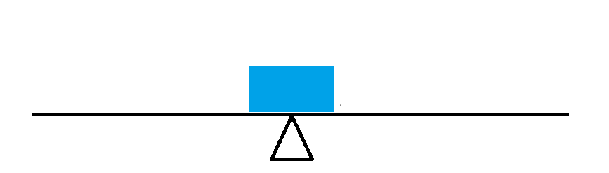
In what sense is the mean the center of the distribution of the heights that we observe? i.e. In what sense is this a typical observation? Suppose we were to think of each observation as being a weight (say a one pound weight) and that we spread them out on a beam according to their actual value (on the x axis = beam). Then the mean would be the point at which if the beam were placed on a pivot or fulcrum, it would balance exactly. i.e. Suppose that we have just one observation, the beam balances at that observation = mean.
Now suppose we have two more observations, one below the mean and another equidistant from the mean but above the mean. Here I have placed them so that they are equidistant from the mean. Clearly the bar will still balance on the same fulcrum - the mean here does not change.

Finally, suppose we have three more observations, two below the mean at the same point as each other halfway between the mean and the lowest weight, the other one above the mean but at the same value as the highest weight. We still balance at the same point, because the further from the mean the greater the force downwards. Again the mean is the balance point.
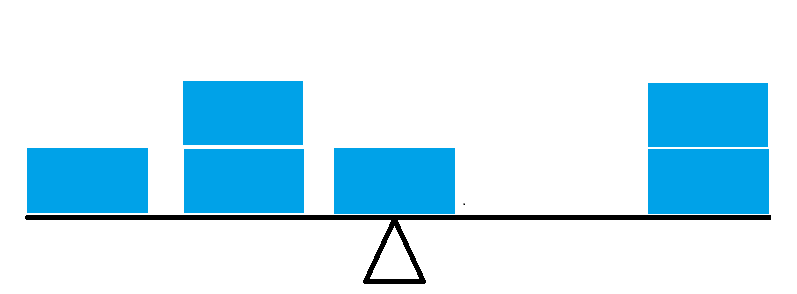
The mean is always the balance point, which gives a visual way of seeing what the mean should be when you look at a histogram or distribution of the data. It is usually fairly easy to guess relatively accurately what the mean of the data is without any calculations at all. Another way to see the mean is that it is the choice for the central value when we take the sum of the smallest squared distances of the data to the central number. See the mathematical derivation here.
It is often useful to code non-numerical data using numbers. For a Yes/No or Success/Fail type problem where there are only two outcomes, we can code responses as $$ {x_i} = \begin{cases} 0 & \quad \text{if no/fail}\\ 1 & \quad \text{if yes/success }\\ \end{cases} $$ Some examples: 1. Political poll. "Did you vote for the incumbant?" has a yes/no answer. Political exit polls of this type are very often employed to verify accuracy or for 'early reporting'. May recall the Florida 2000 vote on this. 2. Employed/unemployed. In a labor study you might want to measure such occurances. Obviously this is of interest for research into the effects of unemployment. 3. Male/Female. Often in studies such attributes are employed as 'causes' and examined. Notice that the sample mean is constructed via the same formula as above, i.e. $$ \bar{x} = \frac{1}{n}\sum_{i=1}^{n} x_i $$ but this is just the number of yes/successes in the sample, since otherwise we get zeros in the sum, hence $$ \bar{x} = \frac{\text{number of successes}}{\text{total number of observations}} $$ Since it is just a special case of a sample mean, we will examine it in the same way as we shall see later in the course. Often this special case is called a 'sample proportion' since it gives the proportion of yes/successes.
At this point we realize that the heights of the frequency graph, as well as the values in the empirical cumulative distribution function, were all averages. Recall we wrote these as $$ \text{frequency} = \frac{1}{n} \sum_{i=1}^{n} 1(\text{lower bound} \leq x_{i} < \text{upper bound})$$ and $$\frac{1}{n}\sum_{i=1}^{n}{1(x_i \lt x)}.$$ These are special cases of the proportions version of the sample mean, where the indicator function $1(A)$ are zeros and ones. All of them can be examined and understood statistically using all we learn about sample means in this course.
2.2.1(ii) Sample Median
The second most used concept of the `center' of a distribution is the median. The median is the very middle observation in the data. To compute this, simply rank all of the observations from the smallest to the largest, and report the value of the middle observation.
| Observation | Value for Car |
|---|---|
| $ x_4 $ | 1000 |
| $ x_5 $ | 2000 |
| $ x_2 $ | 2100 |
| $ x_3 $ | 2300 |
| $ x_1 $ | 2500 |
The median is simply the center or middle observation, here $2100. We have that half the observations are below, and half are above, making this a candidate for the `typical' observation or center of a distribution. Notice that this only strictly works if we have an odd number of observations, if we have an even number just take the value halfway between the two center observations, so that there is actually a middle observation.
Suppose that in our insurance example we did not observe $ x_3 $. In this case our ordered observations are given by the following table.
| Observation | Value for Car |
|---|---|
| $ x_4 $ | 1000 |
| $ x_5 $ | 2000 |
| $ x_2 $ | 2100 |
| $ x_1 $ | 2500 |
The middle of the observations is now between 2000 dollars and 2100 dollars. By rule we simply take the middle of this range, which would be 2050 dollars and report that as the mean.
2.2.1(iii) Sample Mode
The mode of a distribution of data (or set of data) is the most frequently observed value. This is easiest to see from a frequency distribution. For our insurance example all the observations are different, so there is no 'most frequent' opbservation. The notion of the sample mode is not all that interesting for small datasets, where it is common to find each observation occuring only once. But it is a useful descption of a distribution when we have lots of observations. Consider our Mutual funds example.
In this example (although note that the observations have been binned), we see that values from zero to 5 percent are most common as this is the highest bar in the histogram. We refer to this bin then as the mode.
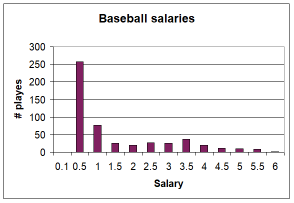
Unlike the mean or median, it is possible to have more than one mode. The following gives 1994 baseball salaries (source: USA today) where salaries include pro-rated signing bonuses. The salaries are given in millions. Whilst technically there is one maximum here, we call such distributions bimodal because of the second peak at around or below $3.5 million. What is usually going on with bimodal distributions is that we are mixing in two different groups. In terms of baseball salaries, there are the standard players who receive minimum wage and the stars that sign for more. The peak at the low end is the minimum wage guys.
2.2.1(iv) The Relationship between the Measures
In general, there is no reason why any one of the above measures should equal another, so we are faced with a choice of which measure to use. Consider the following distribution
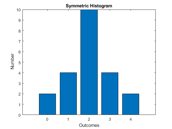
This distribution is symmetric (mirrored around the center). It has only one mode. For such a distribution, we have the relationship mean = median = mode.
Suppose that we take one of the observations from the first column and place in the second column, what happens to the different measures?
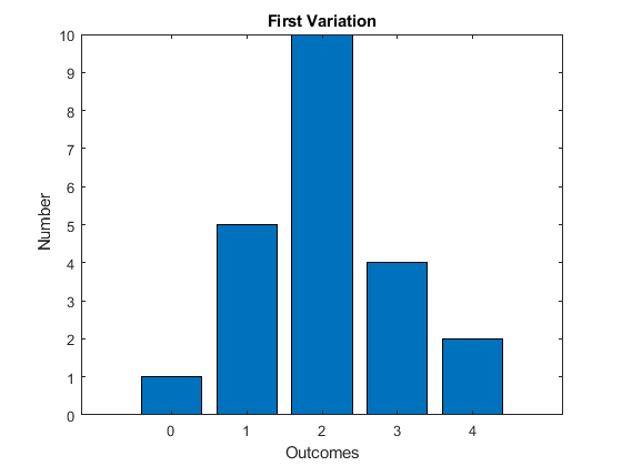
The mode is clearly unchanged. The median too is unchanged, we have only moved around some of the observations in the bottom half of the sample, which has no effect on the middle observation. The mean - this must be larger, the balance point is larger. We have increased a value, so the sum of values must increase, thus the mean must increase. What we see here is that the mean is sensitive to small changes. This sensitivity is very apparent when the observations are `outliers', or observations far from the rest of the observations. Consider the car insurance example. The value of 1000 is clearly far from the other observations, it is an outlier. The median here is 1980, much lower than the median of 2100. Is the insurance adjuster going to use the median of the mean to pay you back? Notice that 1980 is not in any way a typical observation, it is lower than four of the five observations.
Suppose now that we take from the second column and put these observations at the fourth (outcome = 3) column. What is affected now?
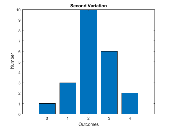
The mode is still unaffected. The median now is likely still the same, but could have become larger by moving observations from below the median to above. The reason it is unchanged here is that we have a lot of observations at a value of 2, so the middle is likely still at 2. The mean has become even larger.
Which is the best measure? This really depends on the problem. The mean is often the most easily understood, however is subject to the problem that we have seen in that it is the most sensitive to the actual data counted. i.e. Suppose you just happen to mismeasure one observation, or perhaps there is a `weird' observation, then the mean can be very misleading.There is more to describing a distribution than its center.
2.2.2 Measures of Spread
The concept of the center of a distribution only takes us so far in understanding what a typical observation might look like. Suppose that we are trying to decide between two investment advisors. Both have the same average return. The first advisor has returns that are always positive, the second has some returns that are higher than the other investor but also some negative, i.e. the distributions are as follows.
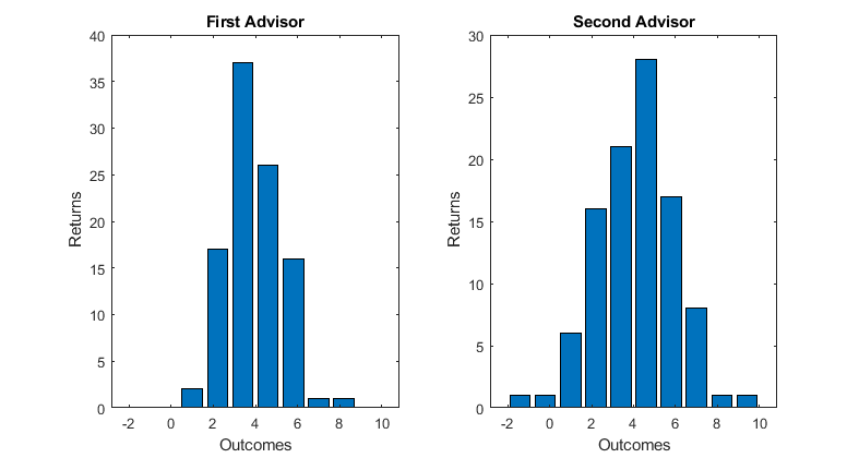
The mean is clearly not enough to describe either of these distributions, we need more. It is indeed helpful in understanding what a `typical' observation looks like to know how spread out the observations are. For example if you are risk averse, you might like advisor one because they never lose money, if you like to take a risk you might choose advisor 2 because there is more of a chance of a higher return. As before we have many different measures.
2.2.2(i) Range of the Data
The simplest numbers to report are the lowest and highest values. These would be the top and bottom of the boxplot. Whilst these are simple to observe and report, they are clearly very imfluenced by outliers and mismeasured values. It is for this reason that often boxplots do not report the end of the whiskers as the range but instead the range after some rule to remove outliers. All the same, as we discussed with boxplots it is better to know what is in the data. However the range is not a method of understanding the spread of the data we will use.
2.2.2(ii). Interquartile Range (IQR)
Recall that the median was the value such that half the observations were below and half above. The interquartile range is a similar concept where now the lower end of the IQR is the value such that one quarter of the observations are below that number and the upper end of the IQR is the value for which three quarters of the observations are below that number. This means that half the observations are between the lower and upper value of the IQR, which is how you should understand this concept.
Computation follows similarly to how we computed the median, indeed the lower value for the IQR is the median of the values below the median of the entire dataset. So we simply order the data, count their rank and find the values for which we go past one quarter and three quarters of the data. Typically of course we would simply do this on a computer, Excel for example computes these for you.
2.2.2(iii) Variance/Standard Deviation
We could consider all the observations and how far they are from the mean, i.e. consider computing $(x_i-\bar{x}).$ Clearly these values are related to the spread of the data, it would be nice to take the average spread in this way. However simply taking the average of these distances always results in zero (why?, do the math it is not hard). The reason it adds to zero is that these values are both positive and negative, so you get offsetting values, where as we want that each time the observation is different from the mean that it adds to the spread. One way to make them all positive is to square them, this is what the variance does. So the variance is the average squared distance of the observations from the mean. The formula is $$ s^2 = \frac{1}{n-1} \sum_{i=1}^{n}(x_i-\bar{x})^2 $$
Notice I said 'average' but actually we divide by $n-1$ instead of $n$. There is a reason for this, which we will discuss in Chapter 6, but for now just remember this is how we calculate it. Notice that since we are squaring this takes on values that are in units squared. For example if the data were in dollars, the variance has units dollars squared. Most of us do not have intuition for something like dollars squared, and similarly when you calculate the variance it is hard to understand what the number really means. For this reason (amongst others) it is useful to take the positive square root of the variance, which would be back in the original units. We call this the standard deviation, i.e. $s=\sqrt{s^2}.$ Mostly we will use the standard deviation, for which we (eventually) will have very good intuition over.
Computing the variance or standard deviation is as easy as following the formula. Going back to our insurance example, we can demonstrate. Recall that we calculated the mean to be 1980 dollars.
| Observation | Value for Car | $(x_i-\bar{x})$ | $(x_i-\bar{x})^2$ |
|---|---|---|---|
| $ x_{1} $ | 2500 | 520 | 270,400 |
| $ x_2 $ | 2100 | 120 | 14,400 |
| $ x_3 $ | 2300 | 320 | 102,400 |
| $ x_4 $ | 1000 | -980 | 960,400 |
| $ x_5 $ | 2000 | 20 | 400 |
| 1,348,000 |
The sum of the squared differences from the mean is 1,348,000. Divide this by four (the number of observations minus one) gets us to $s^2=33,700$. As advertised, it does not mean much, but it has units of dollars squared. Take the standard deviation, which is to say take the positive square root, and we have $s=581$ (approximately). This is in the same units as the data, and is close to the numbers for the deviation column (third column).
So how do we want to think about the variance/standard deviation? For now it is clear that the larger the value the more spread out the data is. For the variance to be larger, it means that the data has to be spread more away from the mean, which is of course what we mean by being spread out. Notice also that, just like the mean, the variance/standard deviation is strongly affected by outliers. We recall that in our insurance example the particularly low value ($x_4$) is far from the other observations, it can be seen from the table above that it has an outsized impact on the variance, indeed it is nearly all of the variance calculation. Later we make a lot of use of the standard deviation, it is worth remembering this problem with the standard deviation.
Just as there is more to a distribution than the center and spread, we have more statistics designed to help provide summaries of the data.
2.2.3 Measure of Skew
Some distributions 'lean' towards one side or the other, so that there is a tail of observations going in one direction away from the center of the distribution. Consider the following two figures.
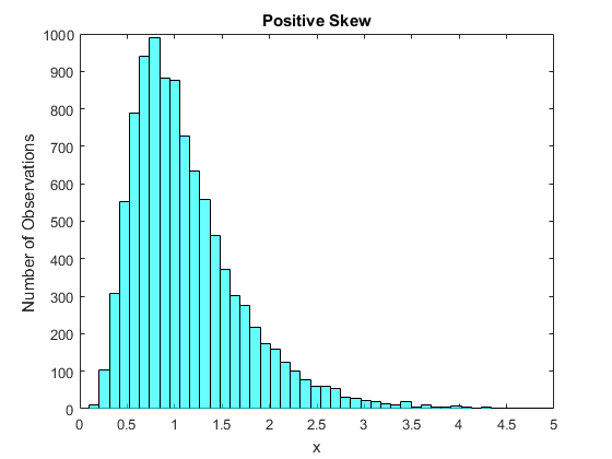
Figure 15 shows a distribution with a positive skew. Here the main mass of the distribution is around $0.5$ to $1.5$, however there are few observations far below this mass and many observations far above this mass. Hence what we see in the histogram is a long right handed tail of the distribution. We refer to distributions that look like this as positively skewed.
Many datasets exhibit positive skews. The main reason is that in many situations we have a lower bound on the possible values that can be taken on by what we are measuring. Suppose that we are measureing income. If we define income as how much we earn, then we do not see negative incomes. There are a lot of people with relatively low incomes and for people who earn a lot more than most there is a wide variation of incomes. Hence we would expect (and we do find) that income distributions are positively skewed. Another example is the time it takes to wait for something. Suppose you had data on how long it takes your cable company to answer the phone when you call tech support. Perhaps most are answered quickly, but occasionally they are busy and you end up occasionally waiting a long time. This too would lead to a positively skewed distribution.
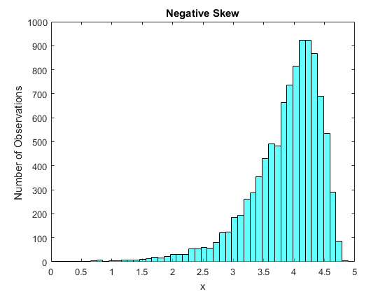
Figure 16 shows the opposite situation, where the skew is negative. Now most of the mass is from about $3.5$ to $4.5%, with very few observations above this mass and a lot of observations spread out below this mass. So now the tail is on the left hand side of the distribution, we refer to that as a negative skew.
Negatively skewed data is seen less often than positively skewed data, but does happen sometimes. One example is exam scores on easy tests. In this case most students are doing well, however there are always some students who make mistakes leading to a tail going to the left. A second example is age at death. Fortunately most of us will live a long time, into old age. Some will live a bit longer but not a lot longer, and unfortunately some will die relatively early. Since there are more early possibilities than later ones, this would be negatively skewed.
As with the mean and variance, we also have formulas. The usual formula for skewness is $$ skew = \frac{1}{\sigma^{3}(n-1)} \sum_{i=1}^{n}(x_i-\bar{x})^3. $$
Consider taking the cube of the distance from the mean. If we are above the mean, this is a very large positive number and if we are far below the mean it is a very large negative number. So for a positive skew we expect that there are lots of very large positive numbers in the summation and very few large negative numbers, so this sum will be positive. For a negative skew we get the opposite, many large negative numbers in the sum and very few large positive numbers, so the sum overall will be negative. If the distribution is symmetric, so there is no skew, the positive values and negative values in the sum will offset and we will get a number near zero. Hence the names positive and negative skew, they relate to this statistic.
The role of dividing by the cube of the standard deviation should be somewhat obvious. If we measure the data in dollars for example, then the sum of the cubed differences from the mean is in dollars cubed. Since the standard deviation is in dollars, dividing by the cube of this leaves the measure of skew to have no units, it is the right divisor so that we remove units from the measure.
2.2.4 Measure of Kurtosis
We can of course keep taking powers of the difference between the observations and the mean forever, however taking the fourth power is sometimes interesting. So we will look at this case and stop here. We measure kurtosis by the statistic $$ kurtosis = \frac{1}{\sigma^{4}(n-1)} \sum_{i=1}^{n}(x_i-\bar{x})^4.$$ The division by the square of the variance (or standard deviation to the fourth power) should by now be clear, it is to clean up the units and make the measure unitless. Taking the fourth power of the difference between the data and the mean results in a positive value always. However it gives a far greater weight to large deviations from the mean than say the variance calculation does, which means that we get very large values for the kurtosis when there are relatively more observations that are far from the mean in either direction (Kurtosis does not care about the direction, unlike skewness). So we often call distributions with excessive Kurtosis 'fat tailed' distributions, because they have a lot more observations far from the mean.
Occasionally you will see that the kurtosis is compared to being above or below three. This is because there is a very common distribution that we will see later (the normal distribution) which has kurtosis equal to three, so comparing to three is just comparing to the normal distribution. One common example of excess kurtosis in the data is for returns in the stock market. It turns out that often with stocks there are lots of small shifts and quite a few large shifts in either direction, which gives this effect. Hence in finance this measure is taken seriously as the feature it examines arises often.
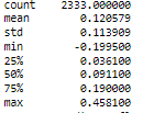
2.2.5 The Returns Example
Going back to our returns example, we can compute the various numbers we have been considering. Most standard packages have a 'descriptive statistics' function that just gives all or most of the numbers in a single command. The following figure is the output in python (pandas) for describing a single dataset.
2.3 Graphs for Data with Multiple Attributes
Just as there is more to a distribution than the center and spread, we have more statistics designed to help provide summaries of the data.
Eventually, we want to think of more than a single variable, although in this course we stick to a single variable for most of the course. We turn now though to situations where for each observation we observe more than one attribute. Most actual data studies involve more than one attribute, some examples include:
- The mutual fund data had a single attribute per observation, that of the return. We could similarly have collected not only the return for each mutual fund, but also the number of different stocks that each mutual fund invested in.
- Arguments are often made that violence on TV or in video games is contributing to increased violence in society. Is it in the data?
- You are here getting a college degree, presumably in part at least to improve your future financial situation. Do more educated people earn more on average?
- We saw the data on annual manatee deaths - is it likely that it is rising due to greater numbers of boaters on the swamps and rivers?
- We observe for each mutual fund both returns and the number of different stocks held.
- For each person we might observe both the amount of violent TV seen as well as their history of being violent.
- For each person we could observe both the number of years of education and their subsequent income (or alternatively whether or not they have a college degree and their income).
- We could observe not just the numbers of manatees that died but also the number of boat registrations.
When we have pairs of data we can ask more complex questions of the data, indeed much of statistics is about these more complex questions. For example in the mutual funds problem instead of looking at average return we might want to ask if mutual funds that spread the investment over a greater number of stocks have lower or higher returns than those that do not. This is a predictive problem, in the sense that we are really asking whether or not having a greater diversity of the investment (more stocks in the mutual fund) predicts a lower or higher return. In the 'violence' example we might ask a causal story. Does exposure to violence in media lead to a greater level of violence in society? Similarly we could ask whether or not getting a college degree is predictive of having a higher salary, but we might also be interested in asking a causal question - Does getting a college degree cause one to obtain a higher salary? The predictive story and the causal story are different, we will consider this in greater detail in Chapter 6. For now we want to just look for some relationship between the variables.
Consider the data in the following table. Reported are daily aggregates of energy producation for California as calculated by the California ISO (source CAISO Daily Renewables Watch). I have reported the values for Thermal (this is fossil fuels) and SolarPV (photo voltaic solar, California also has thermal solar). Values are in MWh.
| Date | Thermal | SolarPV |
|---|---|---|
| 2017-12-01 | 187796.0 | 48372.0 |
| 2017-12-02 | 146365.0 | 44176.0 |
| 2017-12-03 | 107951.0 | 43260.0 |
| 2017-12-04 | 163331.0 | 49762.0 |
| 2017-12-05 | 186050.0 | 50017.0 |
| 2017-12-06 | 189889.0 | 52083.0 |
| 2017-12-07 | 197639.0 | 52094.0 |
| 2017-12-08 | 203183.0 | 50891.0 |
| 2017-12-09 | 163702.0 | 44097.0 |
| 2017-12-10 | 159016.0 | 36381.0 |
| 2017-12-11 | 207882.0 | 45296.0 |
| 2017-12-12 | 223649.0 | 46333.0 |
| 2017-12-13 | 220875.0 | 49109.0 |
| 2017-12-14 | 209861.0 | 46945.0 |
| 2017-12-15 | 194100.0 | 44981.0 |
| 2017-12-16 | 121711.0 | 32543.0 |
| 2017-12-17 | 134893.0 | 45927.0 |
| 2017-12-18 | 189332.0 | 47269.0 |
| 2017-12-19 | 184472.0 | 47732.0 |
| 2017-12-20 | 180902.0 | 38183.0 |
| 2017-12-21 | 200911.0 | 51162.0 |
| 2017-12-22 | 216209.0 | 45752.0 |
| 2017-12-23 | 174032.0 | 34215.0 |
| 2017-12-24 | 157598.0 | 37029.0 |
| 2017-12-25 | 144471.0 | 34713.0 |
| 2017-12-26 | 183947.0 | 40701.0 |
| 2017-12-27 | 196309.0 | 48740.0 |
| 2017-12-28 | 187377.0 | 49783.0 |
| 2017-12-29 | 170661.0 | 50231.0 |
| 2017-12-30 | 144300.0 | 46223.0 |
| 2017-12-31 | 153760.0 | 38400.0 |
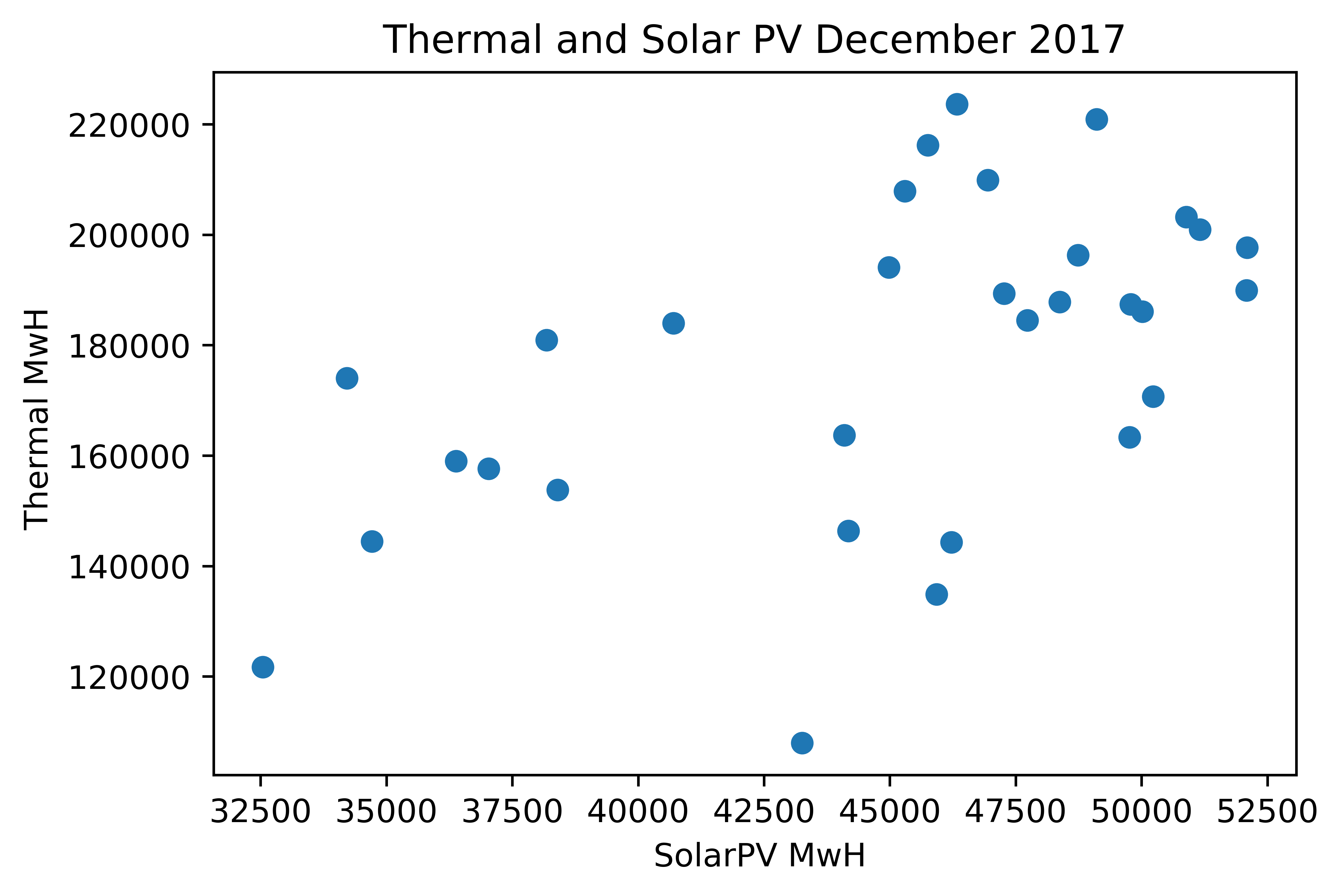
We can see that most of the energy clearly comes from burning fossil fuels. We can look at the data and see that they vary a bit, but it is hard to see what is really going on. Since we are interested in the relationship between them, we really see very little from a table like this. It is better to construct a picture. The main approach to visualizing relationships between two variables is a scatterplot. A scatterplot simply plots the pairs on an xy plot using one of the variables as x and the other as the y variable. Which you choose is fairly arbitrary, however it is common when thinking of causal effects to choose the x variable to be the variable you think is the cause and the y variable to be the variable you think is affected. Here I do not have such a theory, so chose arbitrarily.
Figure 17 shows the relationship between daily aggregates of Thermal and SolarPV use in California in December 2017, i.e. the data from the Table above. Each dot is an (x,y) pair where the x variable is SolarPV and the y is Thermal for a single day of the month. We might have thought that when Solar kicks in (hot sunny days in California) that this might displace the need for thermal energy generation (i.e fossil fuels). Can we see if this is true in the scatterplot? It does not appear to be true, if anything it seems that on days where solar generation is high, thermal generation is also high.
A second plot that can be useful in understanding the relationships between two variables if, like our example here, the data is over time, is to use a time series plot where we plot both variables. This is then the same as our earlier time series plot with a single variable, but now we plot the values of both the variables at each time period. This does lead to a problem if the scale of the variables is different, as if we plot both of the variables on the same scale then one of the variables the variable with the lower scale (here SolarPV) would show up as a flat line. Instead we see here that the scales of the data are different and so I have used the scale on the left axis for Thermal and the scale on the right axis for SolarPV. An issue with this is that an increase in the lines that look the same across both sources actually represents very different actual sizes of increases. As always, a user of graphs must look at the scales to really see what is going on.
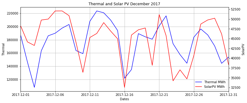
Considering our question of the relationship between the variables, it is quite clear from the time series plot (as it was from the scatterplot) that over the month the two series move in the same directions.
2.4 Summary Measures for Variables with Multiple Attributes
We saw in the graphical examination of data with multiple attributes that we could examine a scatterplot to see if there was some relationship between the variables. We can also think of summary statistics to capture these (much of 120b and 120c does this). Unfortunately, just as in the case of the center of a distribution, any choice of a summary statistic can lead to missing the real relationship, i.e.there is no ideal method.
The notions of correlation and covariance basically fall under the idea that there is some form to the pattern of the scatterplot. It might sweep upward from left to right, giving the suggestion that there is the likelihood that the larger one variable is the larger the other is likely to be.
The simplest notion of thinking about the relationship between two sets of data is the idea of covariance or correlation. Even those who do not know how to compute these measures understand the basic ideas. If there are two variables where when one is large the other is likely to also be large, we say that they are positively correlated, if there are two Variables where if one is large the other is likely to be small we say they are negatively correlated.
For this we need two sets of data, we denote the first one x and the second one y, and we have pairs of data {$x_i,y_i$} for i=1,...,n. For example this could be income and education for each person i.
The formula for covariance is $$ s_{xy} = \frac{1}{n-1} \sum_{i=1}^n (x_1-\bar{x})(y_i-\bar{y}) $$ where $\bar{x}$ and $\bar{y}$ are the means of x and y respectively.
Relating this to the graph is the easiest way to see what is going on here.
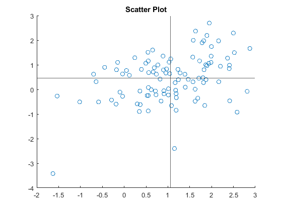
We have the (x,y) pairs on the Cartesian diagram, and I have drawn lines at the means of each (this really just rebases the cordinate system so the variables have mean zero). Now, consider what happens for data in each of the four quadrants constructed by the graph. If both $(x_i-\bar{x})$ and $(y_i-\bar{y})$ are the same sign (this is data in the upper right or lower quadrants) then in the sum it makes $s_{xy}$ bigger. If they are of opposite signs the product of the two terms is negative (upper left or lower right quadrants) then in the sum it makes $s_{xy}$ smaller and maybe negative.
So we can see what happens to the covariance under different possibilities (a) if there is a broad upward sweep of the data from the left to the right (as in Figure 19), which we have been calling a positive correlation, we see that most of the data points will be in the Lower Left or Upper Right quadrants. So most of the terms in the sum are positive, and we have a positive covariance. (b) if there is a broad downward sweep of the data from the left to the right, which we would call a negative correlation, we see that most of the data points will be in the Upper Left or Lower Right quadrants. So most of the terms in the sum are negative, and we have a negative covariance. (c) if there is no relationship, we would expect that the data would be evenly spread in all the quadrants. The positive terms are offset by the negative terms, and we have a zero covariance.
Notice the units of the covariance - for income and education, it is something like dollar years - for manatees and registrations it is something like manatee registrations. This is troubling - just like the variance the actual number seems meaningless by itself (even though we learn something from its sign). Instead we might want to remove the units, this is what the correlation does. We would prefer also to have an idea of how strong the relationship is, and also some idea of what the numbers mean. The correlation is $$ \rho_{xy} = \frac{s_{xy}}{s_x s_y} $$ Recall that $s_x$ is the standard deviation of x, $s_y$ is the standard deviation of y and both of these are positive. This statistic has the same sign properties as the covariance (divide by a positive number always) but is bounded between -1 and 1. The stronger the relationship, the closer is the correlation to plus or minus one. Some issues with the correlation/covariance. (a) measures linear relationship, i.e. could be a U shaped distribution but the positives and the negatives still offset (b) as with the mean, can be seriously affected by outliers (look back at figure 19).
Copyright © Graham Elliott
Distributed By Themewagon